

Think about the first time you watched The Matrix. You probably remember the green tint on everything. That wasn't an accident. It was a deliberate choice to make you feel like you were inside a computer simulation. Now think of Schindler's List. The world is black and white, except for one little girl in a red coat. That splash of color screams louder than any dialogue could. This is the power of color theory in cinemathe strategic use of hue, saturation, and brightness to guide audience emotion and narrative understanding.
We often talk about acting or screenwriting when we discuss what makes a movie good. But the colors on your screen are doing heavy lifting too. They tell you how to feel before the characters even speak. Whether it’s the sickly yellow of a horror house or the cool blue of a lonely city night, filmmakers use color palettes to build worlds and define moods. If you want to understand why certain scenes hit you hard in the gut, you have to look at the paint they used to build them.
The Psychology Behind the Palette
Colors aren't just pretty pictures. They trigger biological and psychological responses. When a director chooses a specific color palettea limited selection of colors used consistently throughout a film to create a unified visual style, they are manipulating your brain chemistry. Warm colors like reds, oranges, and yellows tend to raise heart rates and create feelings of energy, passion, or danger. Cool colors like blues, greens, and purples generally calm us down, but can also signal isolation, depression, or sterility.
Take Amélie as an example. The film is saturated with deep greens and warm reds. These aren't neutral tones. The green represents nature and life, while the red suggests love and desire. By bathing the entire movie in these hues, the director creates a whimsical, dreamlike atmosphere that matches the protagonist's inner world. If they had used gray and beige, the movie would have felt like a documentary instead of a fairy tale.
On the flip side, consider Se7en. The film is drenched in murky browns, grays, and sickly greens. It feels dirty. It feels hopeless. The color grading here isn't trying to be beautiful; it's trying to make you uncomfortable. This is the core job of color in cinema: setting the emotional baseline.
Symbolism Through Color Coding
Beyond general mood, colors act as symbols. Filmmakers assign specific meanings to colors to help tell the story without words. This is called color coding. A character might wear blue when they are sad, then switch to yellow when they find hope. Or a location might be associated with a specific color to mark it as safe or dangerous.
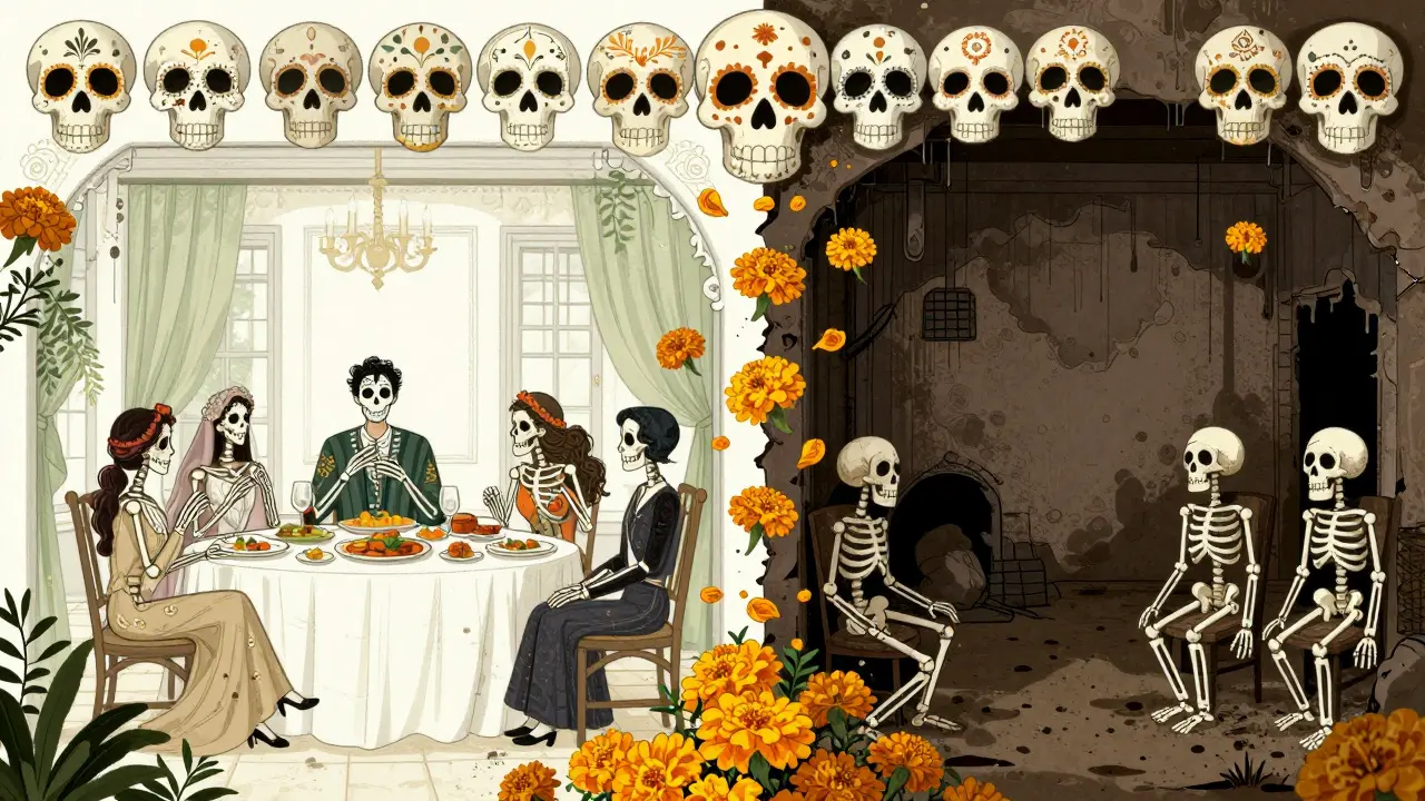
In Parasite, the colors shift depending on which family's space we are in. The wealthy Park family lives in spaces filled with natural light, whites, and soft greens-colors that suggest openness and purity. The poor Kim family lives in a semi-basement apartment dominated by grays, muddy browns, and artificial lights. The contrast between these two palettes visually reinforces the class divide before the plot even gets going.
Another classic example is the use of gold in The Great Gatsby. Gold isn't just a color here; it’s a symbol of wealth, excess, and ultimately, corruption. Every party scene is bathed in golden light. When the money runs out or the truth comes out, the gold turns tarnished or disappears. The color tells you what the object or person represents in the moral universe of the film.
Creating Contrast and Conflict
One of the most effective tools in a cinematographer's kit is complementary color contrast. Complementary colors sit opposite each other on the color wheel-red and green, blue and orange, purple and yellow. When placed next to each other, they vibrate and pop. This technique draws the eye and creates visual tension.
The "teal and orange" look is everywhere in modern Hollywood action movies. Why? Because human skin tone falls in the orange spectrum. By grading the background shadows toward teal (blue-green), the subject stands out sharply from the environment. It looks dramatic, high-contrast, and clean. You see this in almost every Marvel movie or Christopher Nolan film. It’s not just a trend; it’s a practical way to ensure the actor is always the focal point.
But contrast isn't just about making things look sharp. It can represent conflict. In Hero, directed by Zhang Yimou, different versions of the same story are told using different monochromatic palettes. Red signifies passion and bloodshed. Blue represents coldness and distance. White stands for truth and simplicity. By switching palettes, the film communicates that these are different perspectives on the same event. The color changes mean the story changes.
The Role of Color Grading
All this happens during post-production through a process called color gradingthe process of altering and enhancing the image captured by the camera to achieve a specific aesthetic or mood. While color correction fixes technical issues like exposure or white balance, color grading is artistic. It’s where the mood is finalized.
A colorist works with the director to decide the final look. They might desaturate the colors to make a war movie feel gritty and realistic. Or they might oversaturate everything to make a fantasy world feel magical. Tools like DaVinci Resolve allow them to isolate specific colors and change them independently. Want the sky to look more ominous? Pump up the blue channel. Want the sunset to look apocalyptic? Boost the reds and crush the blacks.
This stage is crucial because it unifies the film. Scenes shot on different days, with different lighting conditions, need to look like they belong in the same world. Consistent color grading ensures that the visual language remains coherent. If one scene is bright and sunny and the next is dark and moody without reason, the audience gets confused. The grade ties it all together.
| Color | Emotional Association | Common Narrative Use |
|---|---|---|
| Red | Passion, Danger, Aggression | Romance scenes, violence, warnings |
| Blue | Calm, Sadness, Isolation | Night scenes, sci-fi settings, depression |
| Yellow | Optimism, Sickness, Madness | Childhood memories, toxic environments |
| Green | Nature, Envy, Artificiality | Horror (toxic), sci-fi (digital), envy plots |
| Purple | Mystery, Royalty, Supernatural | Fantasy elements, luxury, weirdness |
Practical Tips for Analyzing Film Color
You don’t need to be a filmmaker to appreciate color theory. You can start noticing it right now. Here is how to train your eye:
- Watch without sound. Mute the TV and watch a five-minute clip. What emotions do the colors evoke? Does the scene feel warm and inviting, or cold and hostile?
- Identify the dominant hue. Look at the overall cast of the image. Is it leaning towards blue, orange, or green? Why do you think the director chose that?
- Track character clothing. Notice if a character’s outfit color changes when their personality or situation changes. A villain might wear black until they redeem themselves, then switch to lighter tones.
- Look for accents. Find the small pops of contrasting color. Where does your eye go first? Usually, it’s the brightest or most saturated spot. That’s where the director wants you to look.
Understanding these elements transforms watching movies from a passive activity into an active analysis. You begin to see the craftsmanship behind the magic.
Modern Trends and Digital Influence
As technology evolves, so does color usage. The rise of digital cameras has changed the dynamic range available to filmmakers. We can now capture more detail in shadows and highlights, allowing for subtler color work. Additionally, social media platforms like Instagram have influenced cinematic aesthetics. Many modern films aim for a "shareable" look-high contrast, vibrant colors, and clean lines that look good on small screens.
However, there is also a counter-movement. Some directors are returning to naturalistic lighting and muted palettes to combat the over-stylized look of blockbusters. Films like The Florida Project use bright, saturated colors to highlight the beauty hidden in poverty, challenging the idea that low-income settings must look gray and depressing. This shows that color theory is not static; it adapts to cultural conversations.
What is the difference between color correction and color grading?
Color correction fixes technical issues like exposure, contrast, and white balance to ensure consistency across shots. Color grading is the artistic process of applying a specific look or mood to the film, such as making it look colder or warmer to match the story's tone.
Why do many action movies use teal and orange?
Teal and orange are complementary colors on the color wheel. Since human skin tone is naturally orange, grading the background shadows toward teal makes the actors stand out sharply from the environment. This creates a high-contrast, dramatic look that keeps the viewer focused on the characters.
How does color affect audience emotion?
Colors trigger psychological responses. Warm colors like red and yellow can increase excitement or anxiety, while cool colors like blue and green tend to calm viewers or create feelings of sadness and isolation. Directors use these associations to subconsciously guide how the audience feels about a scene.
Can color symbolism vary between cultures?
Yes, color symbolism is not universal. For example, white represents purity in Western weddings but mourning in some Eastern cultures. Filmmakers working in international markets or telling diverse stories must be aware of these cultural differences to avoid miscommunication.
What is a color script in filmmaking?
A color script is a visual storyboard created by the cinematographer and director that maps out the color palette for every scene in the film. It helps plan the emotional arc of the movie through color changes, ensuring that the visual style supports the narrative structure.